ROBERT HARRIS Today we are celebrating Robert Harris' birthday.Robert was born 18 September 1849 in Ty'n y Groes, Conwy, Wales, UK. He migrated to Prince Edward Island via Liverpool with his family as a teen. He later studied art in Boston, London's Slade School of Art, in Paris under Léon Bonnat, and in Rome. He traveled extensively, finally settling in Montreal.
Robert Harris mainly worked in, Canada and was noted for his portrait paintings, especially THE FATHERS OF CONFEDERATION. No doubt due to his excellent art education, the commission in 1883 to paint the Fathers of Confederation came early in his career and it established his reputation as a portrait painter. He was a founding member of the Royal Canadian Academy of Arts (RCA) and was elected president of the RCA in 1893. Luckily Robert also painted landscapes and as I love landscapes that is what I've chosen to share today. I love the subtle pastels and misty mountains. He has included just enough shadow to make the trees stand out. The warm naples yellow of the foreground and the lovely soft cerulean and violet blues of the background are perfect complements. This morning I painted a little watercolour inspired by this painting. I've titled it rolling hills. It can be seen on my Daily Paintworks link to the left.
ROLLING HILLS by Sea Dean 4" x 6" Strathmore 140lb WC Paper with Postcard back
COOL CAT
4" x 6" Strathmore 140lb 300 g/m2
Original watercolor
I can't stay away from painting animals too long. I was inspired to paint this photo when I couldn't sleep a few nights ago. Those eyes grabbed me and pulled me in and said "Paint me, paint me!". I usually paint cats that have slitty pupils, but these wide open blue pools were so beautiful that I reached for my handy little watercolour set and got started.
At first I thought I would do a quick sketch, but it was about 4am when I finally put my brush down. It's amazing how long a small painting can take sometimes. They always say don't attempt to paint every piece of hair or fur, but in this case I think it works beautifully. Unfortunately every hair was carefully considered and that took time.
I've received word that I have at least one sale at our new airport location and perhaps more. I'm contemplating what to submit for the next call, closing in April. It is requested that we focus on locally inspired art. Visitors are attracted to our area for so many reasons, the lakes, the fishing, the skiing, the wineries, the fruit, hiking, water sports etc. that there are so many options to choose from. Last time I submitted mainly local scenes on canvas, but I haven't painted many lately.
We can only submit 10 works and they are exhibited for half a year, so it's a bit nerve racking. Small, inexpensive and stunning sells well, but 10 x $50 is only $500 less commission and fees so not a good payback for all the work. 10 x $100 sounds better, but they would have to be totally awe inspiring to sell at that price in a departure lounge.
I'm considering wildlife for a change and I don't mean what spills out of the local clubs at closing time.
HEART AND ROSES
Acrylic on 6" x 9" Strathmore Windpower
One of the most important things a modern artist can learn is nothing to do with painting, it is how to create an accurate image of their work to post on the internet. Van Gogh and Monet didn't have this problem, but the further we move into the onscreen age the more important this becomes.
I've discovered that not every technique works for every artist. A lot of it depends on where you live (ambient light) and what media you use. I've developed my own method based on hundreds of tips I've explored, but I still have challenges with some paintings, particularly those with iridescent, interference or fluorescent paint. This painting is one of those and I'm sure it hasn't sold yet because I just can't take an accurate image.
I follow a blog by Karen Margulis who is a pastel artist and these are her tips. Do you have any tips you can share in comments?
How I Photograph My Paintings by Karen Maruglis
It has to be low tech and low maintenance. I want quality photos of my paintings for my blog but I don't want to spend a lot of time taking them. I need to point, shoot, upload and not have to do much editing. I have worked out a system that works for me. It is simple and takes little effort.
All I use is a point and shoot digital camera and take a photo of the painting while it is still up on the easel. Nothing fancy. I just point and shoot and keep the flash on.
My easel and current painting. When I am finished painting I take the photo
Keep in mind this is the set up I use to take low resolution photos for blogging and for email. I also use them to print small photos and for my business cards. If I need higher resolution photos I will increase the quality setting on my camera to high (about 10 megapixels)
I use a Panasonic Lumix digital camera set on a medium quality setting.
I always keep the flash on.
I don't use a tripod but I do have steady hands.
I stand about 4-5 feet from the painting and zoom into the painting. I don't crop it in the camera but leave a bit of the foamcore showing.(I will crop it when I upload the photo to my computer)
I have two fluorescent light fixtures over my easel area. I keep a warm and cool bulb in each.
This balance of light along with the camera flash results in color that is very true to my paintings.
I upload the photos to my computer. I have an iMac and use iPhoto. I crop the photo in iPhoto. Occasionally I need to adjust brightness, contrast or saturation which is easily done in iPhoto. 95% of the time I don't have to make adjustments.
This system works well for me. Since we all have different lighting situations it will take some experimentation to find the correct balance of light to get the truest colors. If your photos come out too warm or yellow....try turning on the flash and stand back about 5 feet.
HAPPY HEART VII (The Patriot)
Original Mixed Media with gold, bronze and silver
6" x 4" 140lb 300 G/M2
I read this article on how successful women start their day and I was struck by the propensity to meditate and exercise. Personally I use the early hours when I'm brightest to accomplish detailed tasks that I will be too tired or disinterested in to tackle later.
5am - 8 am (Time depends whether I've worked into the night or not, which is fairly common)
Get up, stumble to the bathroom. On the way turn on the kettle which I've filled the night before because my eyes are barely open yet.
5:15 - 8:15 am
Down that delicious cup of coffee which I generally take back to bed with me
5:15 - 8:15 am for a few hours
Tackle emails, check blog makes sense and went out OK, read incoming blogs, newsletters etc. and post interesting stuff to GET YOUR ART OUT THERE Facebook Group.
6 - 12 noon - I always have breakfast but timing could be anything before noon. Usually coffee gets me motivated and I eat when I feel hungry.
10 am ish - Have a nice hot cup of English Breakfast Tea. Oh so delicious!
10 - 1pm - Start work on my daily painting(s) - now the fun begins!
I'm curious what your mornings are like. Leave a comment or if you're shy feel free to email me.
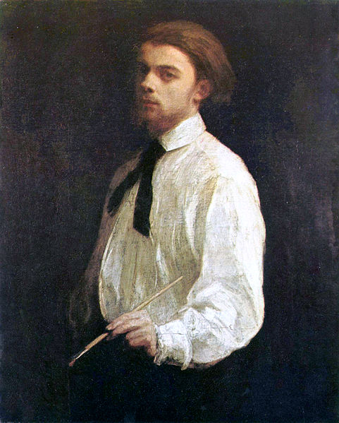
Gosh, what a mouthful. I wonder if his friends called him Iggy. Nonetheless he was born 14 January 1836 in Grenoble, France with the same birth date as Impressionist Berthe Morisot.
He studied under Gustav Courbet in 1862 and exhibited at the Salon des Refusees in 1863. He painted flowers, still life, self portraits and interpreted music in paint. He was also a lithographer.
Fantin-Latour was a friend of Edouard Manet and their influence on each other is apparent in their respective work. Although his cataglogue mostly pre-dates them, along with many famous impressionists, he was part of the group at the Cafe Guerbois.
SELF PORTRAIT 1858
Fantin-Latour looks very charismatic in his self-portraits (of which there are many), therefore it's no surprise that he was a friend of Manet. I chose to paint a portrait because his flowers are highly detailed and would take longer than the constraints of daily painting. I'm not generally a watercolorist or portrait painter, so this was a good exercise for me.
25 August 1904 Died at Bure, France in the Champagne region.
Here is my version of the 1858 self-portrait. A self-portrait is one of the easiest things for an artist to paint because the model is at hand and you don't have to pay them. However, emotionally, I think it is one of the bravest choices. I'm not that brave yet.
FANTIN-LATOUR SELFIE by Sea Dean
On first glance these two portraits look very similar, but as I was painting I realized that the 1858 portrait showed a much less mature person in more than looks.
He was 22 in the earlier portrait and 33 in the later one. I believe that Fantin-Latour chose the same stance, lighting and artists' smock to measure his aging and progress as an artist.
I journeyed through many stages, trying to decide just how closely I wanted the portrait to resemble the original. First, it was a simple exercise to learn more about the medium, but as often happens during a portrait, I began to communicate with the sitter on a deeper level. I was fascinated by what I was revealing. In 1858 the subject appears very young, with a passion for life, even though he chose a serious pose. By 1869 he appears wary and the spark of youth is gone. I feel I should paint the 1869 portrait now, to reveal the secrets hidden in the shadows.
3.5 x 4.75
Mixed Media on French watercolor paper SHIPPING 16th MARCH 2016 OR LATER
SOME PAINTINGS AVAILABLE FOR IMMEDIATE SHIPPING FROM MY OUTLETS AS NOTED IN DESCRIPTION ONDAILY PAINTWORKS
ALL TIME 5th MOST POPULAR BLOG
Originally published by Sea Dean 16th April 2015
Some links may no longer be active
The postcards which I used for the swap are above and can be purchased here
GAIA ENERGY by Sea Dean
GAIA ENERGY
by Sea Dean
8" x 10" Canvas Panel
View my online Gallery of originals here DAILY PAINTWORKS
Shop for Limited Edition ACEO here
Art Cards $5 and Art Postcards $3 here
The painting above is the only original of the five postcards I sent which is still available. It can be purchased here for only $90
LIBERATE YOUR ART
I was introduced to LIBERATE YOUR ART by Sheila Delgado, an internet friend and fabulous artist whose work can be seen here. I've enjoyed the sway for many reasons. I love seeing work from fellow artists, particularly those from different countries or ones that I would not usually come into contact with.
Over the next couple of weeks I will be introducing my blog readers to the artists whose postcards I received in the swap, so follow my blog to see their work and learn about their journey. In preparing the blogs I have matched some of my work to theirs and enjoyed that process because it has inspired me in new directions. Thank you Kat.
I have already heard from one artist who received my card in Singapore, and one in the USA. I've received one from Sheila Delgado and Carlyn Clark in California, Rebecca Hill in Evanston, Illinois, Eric Bruth in Paris, France and Marjorie Thompson in Washington, USA. There are two more somewhere in the mail.
HOW IT WORKS
Once a year, postcards of your work, address labels and postage are mailed to Kat Sloma in the USA. On an appointed day she, and an army of volunteers attach postage and address labels to the postcards and they are mailed out to fellow artists. The participating artists live all over the world and you never know what postcards you will receive or where they will be from, so the trip to the mailbox over the next few weeks is very exciting.
The reason Kat does this is to encourage artists to create postcards of their work and many eyes see them as they make their way around the world to their destination. I was lucky that I have already printed postcards of select paintings, so although I heard about it quite late, I managed to get some to Kat in time.
The LIBERATE YOUR ART POSTCARD SWAP is every year, so you too can participate. Get on her mailing list now, so you will receive early reminders. Below is a link to her blog and on into the blog hop. During the hop, go from blog to blog to see who was in the swap and all of the wonderful art that was liberated. Be sure to leave comments and say hi, to increase the connections!
ALL TIME 4th MOST POPULAR BLOGOriginally published 4th January 2015
CITY LIGHT By Sea Dean
10" x 8" Canson Arches Board
Ready to Frame
View my online Gallery of originals please visit DAILY PAINTWORKS
Shop for Limited Edition ACEO here
I had fun with this painting. I enjoyed using the fine point Golden liquid acrylic yesterday and resolved to use it again today, however, yesterday I did the point work first and then painted around and over it. This time I did the point work, painted around and over it and then added final point work. I think I like the second technique more.
I chose an unusual palette vaguely suggested by the Challenge photo on Daily Paintworks. I really went over the top adding Brilliant Blue and Cadmium Orange as well as a hint of purple and Pyrole Red. I wanted to make the trees lime green but the value wasn't dark enough, hence the change to Cadmium and Permanent/Brilliant Blue.
Working with Canson Arches Board is very different to canvas. It has a velvety surface which is absorbent but not in a detrimental way like canvas panel. The colours also seem to stay brighter than working with canvas. Because of the beautiful texture and the raised, glossy lines, I'm very tempted to leave these pieces unvarnished.
ALL TIME 3rd MOST POPULAR BLOG Originally Published 1st January 2015
WHITE MOUNTAINS II by Sea Dean
WHITE MOUNTAINS II By Sea Dean Central Panel of three
10" x 10" Premium Wrap Canvas Ready to hang
View my online Gallery of originals please visit DAILY PAINTWORKS Shop for Limited Edition ACEO here
This painting may be purchased separately or as a triptych which I will be showing in all it's glory on January 3rd. Here you see the central panel. The painting has a substantial amount of texture, especially in the snowy mountain peaks. It is painted on premium heavy duty deep gallery wrap canvas which is designed to last a lifetime.
Mountains are something I love and they are a recurring theme in my work. Before I was a daily painter, I was a daily skier so I have first hand experience of their beauty and awesome presence. I've traveled extensively in the Coastal and Rocky Mountains as well as the Alps and the endless vistas take my breath away.
At this time of year the snow is fresh and crisp like a wedding cake, the air is icy and the powdery snow can often be seen blowing off the peaks in sparkling clouds as depicted here. It is an exhilarating experience to be up in the mountains far away from the bustle of city life and you can bring that feeling into your home with the WHITE MOUNTAINS TRIPTYCH.
8" x 6" on Windpower To view my Gallery or purchase this painting visit Daily Paintworks
Today's task for Leslie Saeta's Art marketing class is to create a new painting and take progress photos at intervals. This month I've been painting PEOPLE'S CHOICE for my online DPW Gallery but today I felt like cutting loose and doing a natural abstract. I find it quite fascinating to watch a painting change, especially an abstract.Here are 7 progress photos showing the birth of "Sunset"
I've painted from this particular photo session before because I love the colour combinations. It was a from flight over Georgia Strait a couple of years ago. There is something very magical about aerial photos; because we are partly above the atmosphere the colours are even more spectacular than at sea level.
This time I chose to paint "Alla Prima" which, means a wet on wet or "Bob Ross" type painting done in one sitting with no drying period in between. Because Acrylics dry so quickly they allow you to layer very soon after you have painted a section which gives a crisper, brighter look, different to Oil painting.
I could have stopped at any stage, because I like them all, but after rotating the painting and adding iridescent highlights, I knew this was it. I will try and capture the shimmering highlights in a photo tomorrow. I LOVE the result!
Image # 1 - Blocking inlayer. I think this is wonderful and if I was Henri Matisse I may have put it on the side as a record and started again. I pressed on.
Image # 2 - Continuing to block in. Here I am testing which colours make the painting pop, with one eye on the original inspiration photo. I am always aware that upper layers including washes, will change the intensity and colour.
Image # 3 - Starting to mix colour and blend. In Oil painting it's a challenge not to create mud at this point, but with Acrylics you just have to wait a few minutes while working on a different area.
Image # 4 - Creating texture. One of the challenges with Acrylics is that they like to suck onto the substrate and flatten. If you are skilled you can create a 3D effect by layering flat surfaces. The only other ways to create depth is to use modelling paste under the paint or to mix thick gel into the paint.
Image # 5 - Thicker texture. This is where the gel comes in.
Image # 6 - Intensifying light with iridecent white. I find this type of paint adds a touch of mystery to a painting but it took some time to understand that in photos and from some angles it appears like a dark splodge rather than a pretty flash.
Image # 7 - Finishing with bronze/gold highlights. These are the ones you have to be particularly careful with the shapes they create.
I didn't set out to paint like Ruth Andre and we use different media, but the end result is somewhat reminiscent of her style. The original photo had Magenta on the bottom, but this painting works either way, or rotated 90 degrees. The portrait aspect converts "Sunset" into a completely abstract painting and makes the iridescent paint look amazing.
Study of a Figure Outdoors: Woman with a Parasol, facing left, 1886.
The pictured woman is Suzanne Hoschedé (c. 1864–1899),
second wife of Claude Monet, Musée d'Orsay.
Claude Oscar Monet was born 14 November 1840 in Paris.
Monet's father was a Grocer, so one would think that his early subjects would be groups of grocery items, but he loved the outdoors and his early paintings often focused on water. Although born in Paris, he was raised in Le Havre. There he was heavily influenced by Boudin who painted dreamy seaside scenes. Later Claude was to have a special boat built where he could paint under cover yet still "plein air". Monet painted scenes in Le Havre, Paris, Giverny, London UK, Holland, and Belgium.
Claude Monet is the most famous Impressionist. He was involved in organizing the Impressionist exhibitions and his painting "Impression Sunrise" was exhibited at the first Impressionist exhibition and bore the name by which the group would become known.The early impressionists mainly lived in the vicinity of Paris and often shared work space. Monet worked with most of them, as well as pre-impressionists Boudin, Manet and Renoir.
In 1923 His eyesight started to fail and he underwent cataract surgery. His paintings grew larger and the colours more complex and subdued as his eyesight worsened. The majority of his later works were inspired by his beautiful garden at Giverny near Paris. On 5 December 1926 he passed away to the home he loved in Giverny.
How do you choose just one Claude Monet painting? Any one you pick is a masterpiece. I chose the top one because I saw two of the series when I was in Paris and they were phenomenal. What really struck me was not the famous rendition of light, but the treatment of the grass. The paintings in the Musee d'Orsay are large and hang high so the grass is at eye level for all but the very tall.
Correct me if I'm wrong, but I think Claude Monet invented the concept of painting in series, a technique used widely by daily painters today. When I work in series, I find that the first is looser and later works are more detailed as I gain understanding of the subject matter. (see my Summer Boy series at Daily Paintworks)
SAILING WITH MONET by Sea Dean
The other interesting thing about the upper and lower renditions of a female with a parasol is that they depict Monet's first and second wives and I think show the difference in his feelings towards his two loves.
HOMAGE TO MONET IMPRESSION SUNRISE by Sea Dean
My Daily Paintworks pieces today were created as demos for my Paint a Masterpiece Class.
SAILING WITH MONET 8" x 10" Gallery Wrap Canvas BY SEA DEAN
HOMAGE TO MONET - IMPRESSION SUNRISE 8" x 10" Gallery Wrap Canvas BY SEA DEAN
Cat # 11031 SOLD Larger originals or prints may be available by contacting me.
GIVERNY 1900 INSPIRED BY MONET by Sea Dean
This is one of the most famous paintings of all time. It gave it's name to one of the most important art movements influencing artists today. That strange green/ blue/ grey colour is a signature of Monet's later works and can be seen in his water lily series as well as many other floral works.
GIVERNY 1900 INSPIRED BY MONET 8" x 10" Gallery Wrap Canvas BY SEA DEAN




+-+Acrylic+-+6+x+8+-+$119.jpg)


