Showing posts with label Master. Show all posts

Sunday, 19 April 2020

FAMOUS ARTIST BIRTHDAY - JOAN MIRO i FERRA


I haven't done one of these artist birthday blogs for a while. With the troubles in Spain over CoVid19, I thought it appropriate to celebrate one of its most famous sons. Sadly, when I was in Barcelona a few years ago, there were so many tourists and everything was so expensive, that I had to choose between venues and Miro didn't make the cut.

One of the bonuses of the viral lockdowns are that most museums and galleries have pumped up their online presence and in some ways it’s better to view the collections online. For those with disabilities and/or aging bodies, that is a good thing. Mostly access to worldwide online collections is free, at least during the pandemic. I predict paid memberships or pay-per-view will be more common when things settle down, so now is a good time to enjoy them.

Joan Miró i Ferrà was a Spanish painter, sculptor, and ceramicist born in Barcelona. A museum dedicated to his work, the Fundació Joan Miró, was established in his native city of Barcelona in 1975 ... Wikipedia
Born: April 20, 1893, Barcelona, Spain
Died: December 25, 1983, Palma, Majorca, Spain (wow he was 90!)
Periods: Surrealism, Modern Art, Dada
THE GARDEN - Joan Miro
Joan Miró was one of my partner Alberts favorite painters. We never owned one of his works, although for a short time we had a Salvador Dali, an artist that was influenced by him. I love Mirós sense of color, but I find his work a bit mid century, which is not my favorite period in art. He did live a long and productive life, transitioning through some of the modern eras most outrageous styles and was highly influential in European and American art. 

In Barcelona there is a large museum and collection dedicated to Miró and its website is well thought out and fascinating. https://www.fmirobcn.org/en/colection/catalog-works/joan-miro. Works date from his early childhood to late in life and show how his style developed through one of the most radical centuries in history. He was nearly 30 before he had established the style we are familiar with. One of the most interesting sections is his biography, which details the evolution of one of the 20th Century greats. 

Wednesday, 8 January 2020

FAMOUS ARTIST BIRTHDAY - JOHN ARTHUR FRASER - MINI MASTER


I’m not sure, but with taking most of the year off in 2019, I don’t think I wrote a single blog on Art History. There are many famous artists to tackle and I’m getting back in the groove. So today the birthday boy is the energetic John Arthur Fraser. He was in born in London, England, 9 January, 1838 Little is known of his early years in London and he was largely known as an artist in Canada and the USA. If I could sum him up in two words it would be Ambitious and Restless.

Fraser was a resident of Montreal by 1860, tinting portrait photographs and managing a photography art department. Fraser’s surviving work from that period displays an unusual degree of sensitivity and skill. The earliest pieces are small head-and-shoulders studies using translucent colours that suggest just enough paint to give the portraits the appearance of delicate miniatures.


By 1864 he had moved on to full-length figurative images set in landscapes painted directly onto the photosensitive paper. He also exhibited landscapes in oil with strong, clear colour and simple mountains and lake compositions.

He became a charter member of the Society of Canadian Artists in 1867 and in 1868 he was elected member of the American Society of Painters in Water Colors, in New York. He then settled in Toronto and on 25 June 1872 Fraser was elected vice-president of the new Ontario Society of Artists. The first exhibition of the OSA opened 14 April 1873 with Fraser showing works “of vivid colour and striking clarity” created using the new coal-tar colours. The naturalism of Fraser’s canvases was praised, as was his skilful handling of paint.

In 1876 he became art superintendent of the Centennial Photographic Company which supplied the Philadelphia Centennial International Exhibition. The extensive art collection encouraged Fraser to submit his largest collection ever to the 1878 annual exhibition and he finally began to exhibit with the American Water Color Society.


In 1880 Fraser’s return to Toronto’s artistic circles assured both his selection as a charter member of the Royal Canadian Academy of Arts and his involvement in the massive publishing project launched that year, Picturesque Canada. Fraser sketched along the entire length of the new CPR line through the Rockies. These mountain pictures are considered Fraser’s most characteristic work, highly naturalistic and relating more to photography than traditional landscape painting.

He later moved to Boston, but maintained connections with Canada and the officers of the CPR. He visited Britain in 1888 and a Scottish water-colour was accepted into the Royal Academy of Arts Exhibition in London that year. He continued to show in Canada and Boston, and in 1891 his water-colours were accepted in the Paris Salon, but his life was centred on the New York Salmagundi Sketch Club and local societies.

Fraser was a restless and ambitious man, perfectly suited to the growth and expansion of Canada. Painting rarely dominated his interests and was often abandoned entirely for other business pursuits, but it is as a painter he will be remembered. Fraser was engrossed by photography and caught up by the sense of nationhood fostered by the rise of the railways across Canada: It is this which gives his painting such memorable force. The largest public collection of his work is in the National Gallery of Canada (Ottawa).

Friday, 21 June 2019

Coffee with Manet?

The question came up recently on Facebook, “Who is your dream painter? Who would you like to have coffee with?“


This was my reply.

“Hmmm, whatever Leonardo had to say would go right over my head, Monet or Turner too annoyingly self opinionated and Michelangelo the same, Franz Marc would be off on a theory tangent, Vincent would have so much angst, Henry Moore my sculptor hero, Yes Sargeant but he’d be off hob knobbing, or ... It strikes me that the charming Edouard Manet would be most fun for coffee and French dainties in a little cafe I know near Notre Dame. But in truth a living artist like Kurt Jackson, David Hockney, Jeff Koons or even local star Robert Dow Reid would be most productive.”


Also, “Definitely not Frida, I’m working on a series and a large commission portrait of her, so I have coffee with her every day.”


In my usual manner I studied what others had replied..... Popular were the Impressionists, and other artists from the 19th Century, but I was pleased to see some old masters and even more pleased to see some from the 20th Century and the last 20 years. Even Bob Ross, got a mention, some say the Mr Rogers of art. 

Monet and Van Gogh are favorite choices in my classes. Artfinder are creating editorial collections of various masters so I’m working on adding my masterpiece studies to Artfinder in the hope they will be selected.


It’s interesting to see the growing list and even more interesting to see who didn’t get a mention.


Others in no particular order were...


Van Gogh,

Monet,

Dali,
Calder,
Hopper,
Degas,
Leonardo,
Constable,
Dali,
O’Keefe,
Winslow Homer,
Rockwell,
Frankenthaler (oh yes!),
Warhol,
Wyeth,
Pollock,
El Greco,
Vermeer,
Bonnard,
Ruskin,
Thomson,
Chagall,
Bateman,
Bob Ross,
Klimt,
Rembrandt,
Kandinsky,
Cassatt,
Frida,
Motherwell,
Mucha,
Morrisot,
Renoir,
Holbein the younger,
Holbein,
Kehinde Wiley,
The Group of Seven,

Some I have to check out (and also check the spellings) 

Dean Mitchell,

Sudi Manning,
George Innes,
Bev Doolittle,
Wolf Kahn,
Shirley Trevena,
Grace Lewis,
Grace Hartigan,
Charles Reid,
Lars Lerin,
Remedous Varo,
Joan Eardly,
Alexey Savcehnko,
Tamara de Lempicka,
Charles Burchfield,


Tuesday, 18 June 2019

Calla and Gardenia Feature


I hit the jackpot again! Two of my paintings, Fragant Gardenia and Calla, have been featured in Artfinder’s ‘Inspired by O’Keefe’ editorial selection. You can view them and all the others HERE


Thursday, 13 June 2019

The Simple Life Shines


I’m pleased to announce that Artfinder has selected THE SIMPLE LIFE for an editorial collection. INSPIRED BY THE GREATS. I’m very proud that my work stands out from thousands of other works from artists around the world. It is a painting that was challenging to create and do justice to Mark Rothko who inspired me. It is one of my personal favorites from the recent solo exhibition 150 YEARS OF ABSTRACT. It can be purchased via Artfinder here. And the collection can be viewed here.


It is strange that I had just selected this painting for a totally unrelated advertising campaign. Big brother is watching! Today I’m selecting more ‘Paint a Masterpiece’ works for my Artfinder gallery.

Monday, 26 November 2018

Where have I been?

I’ve been right here all along, but I’m busy and stressed and too tired to blog. It’s not all bad though. 

One of the things I’ve been doing is working on a commission. Frida III went to my favorite private gallery when my solo closed. The gallery owner loved her and they say you should only sell what you love. I had her slated for another exhibition in November, but just as I was making arrangements to pick her up, she was sold. Then another person came in to buy her and I was asked to take a commission, so I’ve been working on Frida IV. She’s not quite done, but just a few small tweaks may happen before I deliver at the end of the week.

Here is a progress collage. My favorite is #1, which I would have kept and started another canvas, but it was the last of my vintage raw canvases, so I had to keep going. Which one do you like best?


Wednesday, 14 November 2018

A new tool for art lovers

I’ve discovered another tool for art lovers, HENI Talks. These are short videos by experts on various paintings and art works. This is a growing project and you can sign up for news on the latest videos which is very handy. As I grow older, I find visiting galleries and museums increasingly tiring, challenging to organise. As major art works are scattered around the world and are often hidden in the vaults of their owners, I applaud those who are working on making them and knowledgeable experts accessible. Click on the link above to watch a trailer and receive updates.


Blue, Yellow, Red by Jak King

I was introduced to this tool by Jak King, a longtime friend and fellow artist who writes a varied blog centered around his stomping ground in Vancouver B.C., but encompassing ares of interest around the world in general. It makes a refreshing change to the steady stream of art related emails I receive. I also love his photography and bold abstract work, which I feel doesn’t get the exposure it should. Thank you Jak.

Tuesday, 6 March 2018

Post Script


The final week of my Bob Ross extravaganza.

I learned a lot about color from Bob, and my favorite mixes were the warm Cadmium Yellow, Titanium White and a third pigment of Alizarin Crimson, Sap Green, Pthalo Blue or others. The addition of TW to CY seems to warm the cool quality of the TW and tone down the brashness of the CY. Very enlightening.

I just arranged a short showing of my latest work at Meadowbrook in Kelowna. April 29th 2 - 4pm. More as we near the date.

This week at the condo I’m teaching myself how to fix water damaged laminate, as I can’t find a floor layer willing to tackle it. (They’re all too busy with million dollar construction with our building boom.) Wish me luck!

Monday, 5 March 2018

Future News

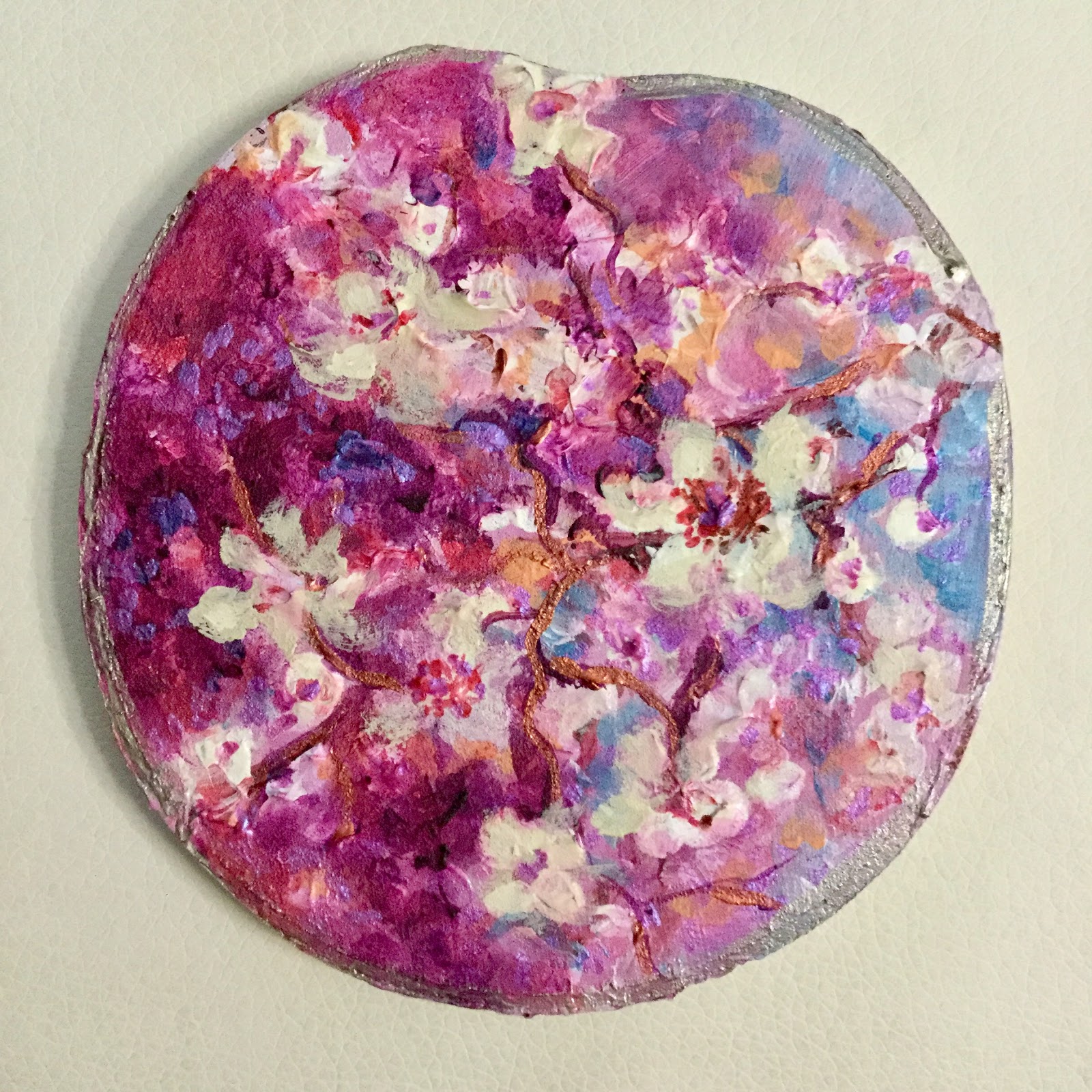
Natural Birch Slice Blossom Circle

On the horizon and fast approaching is the Kat Sloma “Liberate your Art” postcard swap. My postcards have been sent out to the swap location and all I have to do is wait for six lovly pieces of art from around the world, to drop into my mail box. I’ll post them here as they arrive.

This week a brand new selection of my Art Cards will be available at Kelowna Art Gallery. As we change season I will be busy swapping out winter art and dropping off spring art at my various locations. It’s always lovely to see the blossom paintings back on the walls.


And finally the collage of my third week of Bob Ross paint along

Saturday, 3 March 2018

Newsy catch up

Well that was quite a month!

I completed the Opus Daily Practice during the month of February and posted them all on instagram. I learned a bit more about the power of instagram and gained many new followers. Thank you for your clicks.

I also completed the 11th bi-annual Leslie Saeta 30 paintings in 30 days challenge. Some nights I was painting right up to midnight, but managd to do all 30.

Week 1 Opus Daily Practice and Leslie Saeta 30 paintings in 30 days
I entered two paintings in into the Intergenerational Exhibition “Who Are We” and they were accepted. Now on exhibit at Lake Country Art Gallery for the month of March. This is one of LCAGs most eclectic exhibitions, spanning and encouraging collaborations between many different age groups. My paintings are UNISUN with first nation collaboration and MEADOW LAKE, a Bob Ross collaboration from the February series.


On a more personal front my new condo with larger art studio is continuing to take shape. As with all renovations, there is a new challenge each day, but I’m making my way past all the obstacles. After several attempts to find just the right chandelier (too traditional, too modern, too small, too big) and yesterday, beautifully perfect! I now have the just right light over my all purpose dining, craft, sewing and private lesson table.

View from new condo

The old condo is emptying out as I move stuff over to the new one and its getting its final tweaks for selling in two weeks. Sleep has been hard to achieve this month, but I hope to play a bit of catch up this weekend.

Thank you for all the wonderful comments on my work last month and for your loyal followship.

Sea

Friday, 2 March 2018

Happy Bob Ross Facts


Some of my favorites from the February 2018 30 paintings in 30 days challenge. 

Follow my blog for the complete collection of collages in the next few days. 
Thankyou Bob! Your passion continues to inspire present and future generations.


Bob Ross is best known for his calming television program “The Joy of Painting,” where he would spend 26 minutes talking through each step of his paintings in a soothing tone. He loved to encourage people to paint with such inspirational thoughts as “You can do it. There’s no big secret to it. All you need is a dream in your heart
Ross’ show aired on PBS from 1983 until 1994, when Ross was diagnosed with lymphoma. He died in 1995 at the young age of 52, but his legacy lives on in his happy little trees.

Here are 10 happy little facts to know about Ross.

1. He was a drill sergeant

Known for being soft-spoken on air, Ross said he had spent so much time yelling as a drill sergeant that he had gotten it all out of his system.

2. He learned to paint by watching another painters television show.

Ross was in a tavern in Alaska when he saw William Alexander’s program for first time. He continued to watch and gave Alexander full credit for teaching him to paint.

3. Many of Ross’s paintings were donated to PBS

At the end of each show Ross would have a masterpiece. He donated many of them to be auctioned off for donor drives and fundraisers for PBS.

4. Ross was missing a finger

Due to a childhood woodworking accident, Ross lost a finger. Not many notice the missing digit because he always held his palette with the hand that was missing the finger.

5. His iconic hair was not a style choice

Originally Ross had permed his hair in an effort to save money on haircuts. By the time he could afford as many cuts as he would like the perm had already become part of his image and thus had to stay.

6. 90% of viewers do NOT paint during the show

Anyone watching the show has wondered “Is anyone actually painting this with him?.” Well the answer is not many but some. Although the show delivers step by step instructions it is rare that viewers actually took the steps to create their own masterpiece. Most simply enjoyed the pleasure of watching him paint.

7. He once did an entire painting in grey for a color-blind man

He actually combined brown, blues and white to make all the different shades of grey but the final result was a grey painting. Ross chose to do this show after meeting a man who said he could never paint because he was color blind. As we all know Ross truly believed “anyone can paint” and he created this episode to prove it.

8. The image lives on

From t-shirts with his images and quotes on them, to Lego figures and Halloween costumes, more than 20 years after his death Ross continues to inspire.

9. Ross was social media savvy before anyone even knew what it meant

Ross encouraged audience involvement by having them send in ideas about what things he should paint. He also had them send in photos of their paintings they had created while watching the program.

10. Ross is still a media sensation

A quick search on Instagram, twitter, or tumblr will give you all the the Bob Ross you can handle.  You can even spend the weekend binge watching his show “Beauty is Everywhere” which is now available on Netflix.

Thursday, 1 March 2018

Secluded Forest Replay - Bob Ross in Acrylic - S6 E5 - #30in30 - 30 Yay!


It’s amazing what you can do if you put your mind to it. I almost lost it a couple of times during this this season’s 30 in 30, but here I am at Day 30, still in one piece and with 30 new paintings for exhibition and sale. Whooopppeee!

No, you’re not seeing a repost, this is a brand new painting revisiting Bobs “Secluded Forest” video. I wanted to try different paper, more inks and spritzing. I finished just after midnight and the board was still wet and very curled, but I managed to get a decent if slightly warped image. Tomorrow it will flatten out and I’ll scan it.

To view all 30 paintings along with more from my catalog, click here. There are still some open auctions, so don’t miss out if you would like a slice of history.

Tomorrow we show our group collages on Leslie Saetas 30 in 30 Blog, so stay tuned.

Paint Along to Bob Ross - Season 6 Episode 5 - Secluded Forest

Posted on 30 in 30 Blog #8

Thursday, 2 November 2017

Dale Cihuly at Fairchild and Spark by Sea Dean


I love Dale Chihulys work and I’ve often considered becoming a student as his studio is in the Weast. It’s not so left field, because when I was considering uni, I applied for the only (back then) UK BA in stained glass at St Andrews in Scotland. Since then I’ve collected many beautiful glass objects and that in turn has influenced my acrylic sculpture and gemstone jewelry pieces.

I follow an arts show called “Open Studio with Jared Bowen” on WGBH Boston and he recently covered the Dale Chihuly exhibition at Fairchild Tropical Botanic Garden in Florida. Hoping you can link to it here. http://www.wgbh.org/programs/open-studio-with-jared-bowen-2162


The beauty of the exhibition was even more spectacular at night.

Ahhhhhh!


Now do you see the influence?


Tuesday, 31 October 2017

How to paint like ... Mark Rothko

Another in this interesting video series.

As many of you know I teach a class called “Paint a Masterpiece” where artists of any level spend a day recreating a famous artwork to take home. Naturally, when I find some info on master technique I can’t resist a look.

Recently I found a series of well produced YouTube videos put out by MOMA (The Museum of Modern Art)  which go into detail. If you’re interested in stretching your perception of what art is, there is no better study than Rothko.

How to paint like Mark Rothko


Sunday, 29 October 2017

How to paint like .... Jackson Pollock

As many of you know I teach a class called “Paint a Masterpiece” where artists of any level spend a day recreating a famous artwork to take home. Naturally, when I find some info on master technique I can’t resist a look.

Recently I found a series of well produced YouTube videos put out by MOMA (The Museum of Modern Art)  which go into detail. Here is Jackson Pollock, one of my art heroes. Enjoy!

How to paint like Jackson Pollock

Blue Poles


Friday, 27 October 2017

How to paint like ..... Willem de Kooning

As many of you know I teach a class called “Paint a Masterpiece” where artists of any level spend a day recreating a famous artwork to take home. Naturally, when I find some info on master technique I can’t resist a look.

Recently, I found a series of YouTube videos put out by MOMA (The Museum of Modern Art)  which demonstrate some techniques. I rather like the no nonsense style of the instructor. Enjoy!

Willem de Kooning - Part One

Willem de Kooning - Part Two


Friday, 6 October 2017

VAN GOGHS SUNFLOWERS


VAN GOGH SUNFLOWERS

It’s Thanksgiving in Canada and I need a rest, so I’m taking a bit of a break to give thanks for a busy artistic year.. I thought I would leave you with some fascinating reading about Van Gogh and his famous Sunflowers. I stumbled across the article above (link) while researching for a new painting series. Wonderful information on the most famous series of paintings in the world.

Van Gogh is so well known for his sunflowers that few people realize that he painted other flowers. I've pinned some on my Pinterest board “Sea Deans Roses and Other Flowers”, just follow the Pinterest links on the left side of my blog.

And while we're on the subject of Van Gogh, Kelly Santini gave this link to Van Goghs Letters on her blog, which makes fascinating reading.

Wednesday, 30 August 2017

The Master at work - Part Two - Alex Fong

I can now reveal the little study that Alex Fong did during his demo. It is a Burrowing Owl and one lucky attendee (not me) got to take it home! During the demo he also painted part of a landscape and many samples.


To continue from Part One ...

PAINTING TECHNIQUE

There is science in watercolor:

It will dry 25% - 50% lighter so make sure you have it dark enough in the beginning. Some colors get much lighter than others as they dry, so you have to compensate by making them richer. This comes with experience

To soften edges there are two techniques, (i) Paint the color and then add water to it on the paper, or (ii) Paint with water and then add color. Both work well but the latter tends to be more diluted.

You can also add another color to wet areas to darken, dull or enrich, such as Alizarin Crimson to Cadmium Red. And also while the area is still wet you can add more detail. (All the while Alex is going back and forth to his reservoirs and palette for either clean water or greying colors, as well as new thick color from the bottom of his milk cartons.

"Complimentary colors will grey but similar colors will enrich."

Complementaries grey each other; eg blue is a greying agent to yellow. This also works in creating dot highlights; iridescent pink compliments green leaves. It's not random, but considered.

Alex is now on a wide but shallow landscape. He has quickly outlined his objects with graphite pencil and explains that this will be mostly covered with paint, but the odd bit that shows through the transparent pigment is interesting, not a detriment.


"Try not to leave hard edges"
If you're going to feature a hard edged object, Use the same color in thinner paint in the vicinity to echo the color. You can also add it like a halo. If you leave some white areas in the beginning, you have the option to later add some warm brights like Cadmium Deep Yellow or Cadmium Red Light to bring light into that area of the painting. Once the painting is complete, Alex goes in and adds a few hard edged details to compliment the soft edges. A very fine black Stadler permanent marker works well for this.

Another technique for bringing light into a painting is to drop in spots of Titanium White acrylic. This needs a lot of practise. Alex uses a medium round brush first dipped in a solution of liquid soap and water, which protects the brush and gives slip. The brush must be saturated with fairly thick oaint like thick cream or it will be too weak and the dits will be too big. Alex uses his brush horizontal to the surface, holding delicately between thumb and pointing finger, then tapping lightly with the forefinger. (I havent mastered this yet with any technique, but prefer the rather messy spattering with an old toothbrush. This is much less messy if I can master it).


Alex is now working on some reflections. He says it doesnt matter if they match the reflected objects, what is important is the effect. (This was an AHA moment for me because I struggle with the uncomfortable symmetry of reflections. I've started to look for and notice the lack of symmetry in master works and I think my landscapes will change because of this gem of a comment.)

TIP:- For tree trunks and legs dont paint them in, let them sit in mist. In nature there is usually grass or water to cover the roots and feet, so its much more natural to leave them to the imagination.

The final touches are Alex Fongs Chinese Chop and signature. Then three light coats of Golden UV protective spray varnish


Alex cuts large pieces of Canson Arches Board into unusual sizes and has them professionally framed, which adds to the originality of his work. He has an excellent framer who understands his needs and does a great job. As a result of using non standard originals, he ends up with many small off cuts which he uses for small studies like todays owl. In case you're in the central Okanagan, the framer is Mike Breakey (250)717-7793 at Quail Ridge: He also prints Alex Fongs giclees, adding a black edge so they are ready to stretch. They can be mailed to clients rolled or flat to save on shipping.

I hope you've enjoyed this perk at a master. I often go to demos and share what I've learned, as well as personal progress photos of my work and craft projects, so FOLLOW my blog to stay in the loop and continue to be mesmerized by the amazing world of art.

Monday, 28 August 2017

The Master at Work - Alex Fong

ALEX FONG DEMO
I went to an Alex Fong demo last week. Alex is somewhat of a legend on the west coast. He has been painting (and selling) his work since he was in college 40 odd years ago. Along with Robert Bateman, he was an early convert to limited edition prints, so many art lovers that couldn't otherwise afford his work, can own a print for their home.

Alex began by saying that this demo would be about creating light in your painting.

“All the white spaces are the light in your painting. Don’t cover the white unless you’re certain what you want there”.

Alex uses Winsor Newton professional watercolor in tubes because blocks don’t come in as many colors and are not as fine quality. He said he always uses three basic transparent colors, in this case Cobalt blue, Raw sienna and Alizarin crimson. Each main color is squeezed into a shallow container made from the bottom of a square milk container. He adds water creating a reservoir of thin paint which settles and leaves thicker paint at the bottom. The watery paint acts as a barrier to stop the thick paint hardening. He says that one of the biggest mistakes beginners make is too much water; watercolor dries lighter and too much water means it needs to be layered. Access to the thicker paint in the bottom of the reservoir helps offset this.

TIP - Some technical wisdom here is that clean water pushes paint away and colored water attracts, this is why he uses the pre-mixed reservoirs.

He also mixes colors on a used palette covered in dried paint, which greys his colors slightly and is his way of economizing. He never cleans the palette. He uses a lot of green in his work, but straight from the tube they are too brilliant, so he adds complimentary color or palette greys to modify the intensity.

Although Alex used to be a straight watercolorist, he now uses some soft body acrylic to brighten certain areas. He lays out his acrylics in the milk cartons and lightly covers with a film of clean water, which, he says keeps them from drying out for days.


As part of his style, Alex uses dots of masking fluid to protect certain areas, then rubs off the mask at the end and paints the white areas with Liquitex acrylic in Medium Magenta Pink, Brilliant Purple, Iridescent Green, Gold or Copper. He sometimes makes these heart shaped. Those "spots of color are like jewellery to the painting" and make it interesting. A tip here is to leave a slight edge of white paper to bring in more light. Alex uses a variety of paints and inks but a favorite is Flame Orange FW ink, a favorite of mine too.

He also uses acrylic inks and iridescence. He says that iridescent paints are another way to add light to your work. He was using Permanent ink but discovered that its not so permanent under varnish and tends to bleed.

Alex prefers to paint on Canson Arches Board which has texture. He sits it on plywood and adds a few staples to keep it flat because it will still buckle slightly if not. Thinner paper can be stapled or attached around the edge with masking tape, but he prefers board. This is also a favorite of mine, especially for pet portraits. He says that students usually select paper that is too smooth.

The next step is using the brush effectively. The point or end should rarely be used. Load the brush and use the side to stroke over the paper, which breaks up on textured paper and reduces hard edges. If you paint directly with the point it looks unnatural.

Stay Tuned for part two and images of the process by following my blog……

Friday, 4 August 2017

FAMOUS ARTIST BIRTHDAY - Roberto Burle Marx


How cool is this! I came across Roberto Burle Marx on his birthday and I couldn't resist quickly posting a blog. So I apologise for posting late.

Roberto Burle Marx (August 4, 1909 – June 4, 1994) was a Brazilian landscape architect (as well as a painter, print maker, ecologist, naturalist, artist and musician) whose designs of parks and gardens made him world famous. He is accredited with having introduced modernist landscape architecture to Brazil. He was known as a modern nature artist and a public urban space designer. His work had a great influence on tropical garden design in the 20th century. Water gardens were a popular theme in his work. He was deftly able to transfer traditional artistic expressions such as graphic design, tapestry and folk art into his landscape designs. He also designed fabrics, jewellery and stage sets.

Roberto Burle Marx
Born August 4, 1909 São Paulo, Brazil
Died June 4, 1994 (aged 84) Rio de Janeiro, Brazil
Nationality Brazilian
Occupation Landscape architect
Known for Designing gardens and public spaces

He was one of the first people to call for the conservation of Brazil's rainforests. More than 50 plants bear his name. He amassed a substantial collection of plants at his home, including more than 500 philodendrons. The parkscape of the Copacobana is arguably the largest abstract painting in the world at 4km long. This rivals Parque Guell in Barcelona in my mind and is now on my bucket list.

Amazing work and amazing life!