Showing posts with label home decor. Show all posts

Thursday, 2 April 2020

Spring Clean


In order to take my mind off things I’ve been spring cleaning my deck and getting my planters ready for growing veggies and herbs. Currently garden centers are considered an essential service and still open, so I will have some seedlings delivered. There are many early varieties available. Apparently the optimum time to plant lettuce and hardy vegetables around here is mid March, so I have to get my skates on.

As you see after two days of intense work I have most of the balcony swept, wiped and rinsed. I have arranged three tall planters to catch the morning sun, which I may ultimately use for geraniums, but use for seeds or seedlings for now. I have three long planters in full sun for my leaf crops, three more tall planters for root crops and various pots for lavender and other flowers. I’m not a particularly good gardener, so this is a big experiment.

In an effort to keep more reflected light in the area I decided to chalk paint my repurposed shutters and create trellis. They were black and I decided on beige because white might be too reflective and burn the plants.
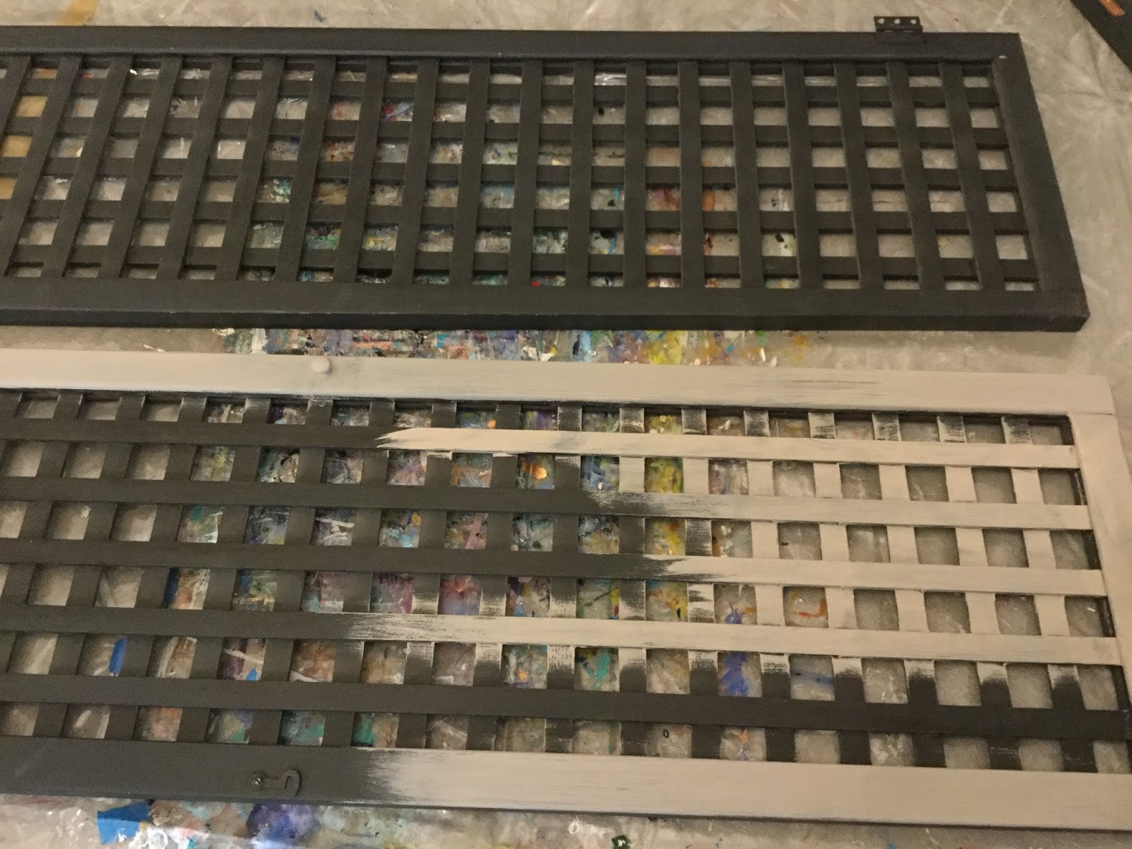

I have yet to refinish my giant farmhouse style table, but since the thrift store delivered it a couple of months ago, it has been used for so many projects. Initially I cut a protective cover from fabric backed vinyl left from another project. Then I cut another thick plastic cover from yardage I had used for classes. These two give me a thick, soft, non skid surface that I don't mind being messy on.

I wasn't too fussy with brush strokes because I love the slightly weathered look, but each of the 8 trellis panels took an hour to paint back and front. There was no need to do two coats, wax or varnish as they are going outside. I love the way chalk paint dries so fast that a project is useable in less than an hour. You get a real sense if achievement.

Monday, 23 March 2020

Hall Table Transformation

When I moved to my current home I had a vision for a beautiful, welcoming entrance way. The hallway is wide and opens onto the lounge: There are  five doors and two openings leading off it, so there is little room for decor. And so began the journey of how to furnish the one long wall. This table was a possibility. It was a rich cherry, shiny, 1990s Queen Anne style, which was totally over the top, but I was charmed by the seashell appliqués.


I love the look of chalk paint and find it a fun and gratifying task, so it was an easy choice. The table was very glossy, so first I rubbed it all over with sandpaper. Sanding isn’t usually necessary with chalk paint, but this table needed some tooth for the paint to stick. I decided to prep the top because a hall table gets a lot of abuse from keys and bags. I used some Miss Mustard Seed Bonding Agent which I purchased on Amazon. This prep is gloopy and I used a brush, so brush marks were visible when dry. I didn't sand the marks, I kinda liked it, but I would probably use a roller next time.

The color I chose is called Cascade, a lovely soft grey/turquoise which seems to look good anywhere. The brand is Folk Art Home Decor Chalk which goes on nicely, but make sure you tighten the lid and wrap in cling wrap when done as it tends to dry out easily. I had let the prep dry for a couple of days, then I applied one coat of Cascade. It’s not necessary to leave for more than a couple of days between coats, but I left mine for a few months before applying a second coat because I became busy.


After the second coat of chalk paint I covered the sides and legs with clear satin wax and then I applied a light coat of white wax around the edges and shells. Because the top of a table gets a lot of use I applied a coat of satin varnish. To match the white wax I added a touch of AntiqueWhite to some Cascade in a clean yoghurt container and stencilled some designs on the top. When that was dry I  sealed it in with another coat of varnish.

While I was in process with this table I had decided on different furniture for my hallway, so it is now ready for sale. Have you ever tried chalk paint? I find it very fast and relaxing. It is also an inexpensive way to update a piece of furniture.

Stay home - Stay safe

Friday, 20 March 2020

Furniture and Finishing

I have waaay too much furniture in process in my studio and around the house. Some is half finished and some is a figment of my imagination. However chances are that I will have plenty of time to get some painted over the next few months.

New seat covers - Chairs now ready for sale
These chairs came with a used table I fell in love with. I have a mega excess of chairs, so these have to go. They came with a ghastly set of covers made from old T-shirts, so they had to go. I unscrewed the seats and removed about 3,000 staples from the shirts. The original covers were mostly in great shape, except one had pen or paint marks on it. Drat!

So I then purchased a meter of beige micro fibre fabric and cut it into four squares. I positioned each square on top of the padding, turned each seat over and folded the corners into place underneath. A quick staple with a gun to hold each corner in place. Then one along each side while pulling the fabric taught. Tidying each corner with two more staples each and one more between each of the side staples for a total of 24 staples per seat. A quick flip, then screwing the seats back into place and voila! A beautiful set of chairs ready for resale.

I have at least 3 months worth of things like this to amuse myself while I’m  self isolating. I would love to hear what you are doing with all the extra time.

Stay home - Stay safe.


Monday, 17 February 2020

DAY 18 of 30 - BEE LODGE (Final)

BEE LODGE (Final version) Mixed Media 7.5 x 5 inches by Sea Dean

Something was bothering me about this bee house so I left it and kept looking until I realized, as so often is the case, that the copper iridescent paint was more or less the same tone as the background and looking a bit blah. I quickly outlined with my new best friend, a Molotow fine black paint pen and voila, now it pops. I also added more black and copper stripes to the bees so they look more real.

Another thing bothering me was that the roof was too bright, so I added more crackle fluid, waited for it to dry and then painted with a creamier antique white. My theory that it would crack down the same lines as the layer below worked. Now I like it much more and can declare it done.

Add caption

I read an interesting article by Sherwyn Williams about hanging your art on the right color walls. I have a feature white wall at home that just doesn't show art well, the taupe walls are much better. Also my community gallery uses a very pale grey. However my Mum had mid to dark grey feature walls in her apartment and everything showed really well on them.

Creating the perfect backdrop for your art


30DCG2020  and ODP

Wednesday, 12 February 2020

DAY 12 of 30 - BIRDHOUSE BLING in Progress

One of the things I love most about the 30 Day Creative Gathering on Facebook is that anything goes. It was set up for creators of every level and any media. Thats why today my entry is a birdhouse. We are encouraged to either complete, or work on something every day and it is very motivating and social.


This is not a fine art birdhouse, it is for regular home decor and will sell under my COUNTRY GIRL brand. At the moment the back and sides are a little bland, so I will probably add more. The front is finished and ready for move in. The spotty bits on the eves and base are sparkly jewels although they don't show up well here.

For sale by contacting me through email or comments. I have three more in process if you would like a set.

30DCG2020 - ODP

Wednesday, 29 January 2020

PEACE TABLE

I’m proud to introduce my latest work of art, PEACE TABLE

This installation was specifically created for this years Lake Country Art Gallery Intergenerational Exhibition, entitled “A Winter Gathering”. I’ve been participating in this exhibition since it began about 7 years ago. Each year I try to step out of the box and create something unusual. I love the challenge and the locals are always sufficiently surprised.

Peace Table isn’t simply refinished furniture, it’s actually fine art painted on a recycled round table. I had been considering purchasing a large round art panel, but when I saw this unloved piece, I just had to give it new life. First I treated the surface, prepping with Golden GAC 100, two coats of gesso and then started painting with quality acrylic paints. By doing this I am following in the footsteps of many famous artists who, when faced with lack of funds, painted on anything they could find..

Most of the sculptures and installations I am producing now have been percolating on my back burner for quite a while. Peace table combines my love of repurposing furniture, my dislike of war, my belief in equality and my ongoing desire to simplify my work.


This painting comes with the option of displaying it as an occasional table or removing the legs and hanging it on the wall using the included attachments. Although it is curing at the moment I will finish with several coats of matte varnish.

Wednesday, 15 January 2020

Trending Decor 2020

SMOOTH by Sea Dean

Avid followers will know that every year I explore home decor colour trends in an effort to create art that fits with popular themes. This year I’ve been pleased to see that designers are veering away from grey and moving towards warmer and more earthy tones.

A NEST FOR TWO by Sea Dean

As for themes, Paris and Antlers are out, but refinished furniture and rustic is still in, although with a softer more textured and less “in your face” look. This suits me perfectly as I still have a mega hoard of interesting pieces ready to refinish. Farmhouse lettering is a bit passé, but well loved country is still popular.

BIRCHES by Sea Dean

More radical trenders will include deep earthy terra cottas and rich browns and golds, but the general look will be warm taupe, beiges, creams, etc. And being a Scandinavian design lover I’m pleased to see very light wood back in style. Also matte black (not shiny and not espresso) is making a come back.
SPARK found item assemblage by Sea Dean

Along with a rich matte look many designers are adding plenty of clear and white glass, skylights, bold accent lighting, sheepskin, homespun fabrics and linen. Leather is perennially popular, but it is definitely moving towards light beiges, taupes, creams and ivories. A nice luscious chunky throw finishes the look.

And is it silver, gold, platinum, oak or black hardware? It seems anything goes, but the look is softer brushed, textured, natural, matte and unfinished lighter wood.

I found this article from a local designer and its spot on.

https://www.kelownanow.com/columns/space_design/


Friday, 14 June 2019

2020 Future Trends

It’s hard to believe, we’re not even half way through the year and Sherwin Williams has already released their color predictions for 2020 HERE. Their intro is animated, eye-catching and fun.


My overall impression is back to muted tones. Soft hints of color, with only one collection of brights, called PLAYFUL. Dusty pink, pinky beige and gentle earth tones seem to dominate their collections. Dusty turquoise still makes a appearance in PLAYFUL and greys are still around. I collaged the less bold collections and quite enjoyed the mix, although none of them would be my choice. It may be interesting to experiment using each selection to create an abstract.

My summer is booking up as I now have two large commissions and some large personal works to finish by fall. I’m projecting that if you are thinking of a commission for Christmas it may be an idea to reserve a spot now.

Wednesday, 3 April 2019

Art and Decor


I’ve often talked about the importance of professional artists keeping up with decor trends, but how about creating your own trend?

I received this image from a patron. That is my painting “Popcorn” in the background, which was gifted by grandma to echo a family joke and has become a precious heirloom. The French Ultramarine chairs were recently purchased to match the painting:

How anout that for creating trends?

Saturday, 26 January 2019

Home Decor Trends 2019


One of the gifts I gave myself this Christmas was a side trip to IKEA. The smaller stores are still fun and a destination choice, but I chose one of the largest and busiest stores in Canada, and that coupled with a delayed flight meant I was skidding around, using all the shortcuts and madly checking things off my list. It was a bit like the Keystone Cops, but I achieved most of my goals.

My major reason for visiting IKEA is getting a sense of trends to inspire my work. In some respects IKEA is such a world force that they lead fashion, but they also have an amazing team of designers who are well versed on trends and reqirements within their customer base. So some of my research for 2019 is based on what IKEA has spent millions to analyse.

Vintage IKEA demonstrates that they used to build heavier, more upmarket items, then they jumped on the cheap and simple bandwagon, but in the last few years they have brought back sturdy (and expensive) designs so they now have two streams. Sadly the basic furniture still looks good but the quality is terrible. The upper 15% is what we need to study.

IKEA is now hiring big names in the artistic community to design signature pieces and though somewhat left field these pieces are exciting and fresh.

Trend I
Comfort. Buyers are getting sentimental about their home environment. As baby boomers age they are downsizing and wanting comfort. They hanker for that big overstuffed easy chair of their father, but they want quality and natural. Young professionals want to escape their intense work envirnment and nest. Real leather, hardwood floors, plush throws and pillows are big.

Trend II
Wood. All kinds of wood are popular, but choices are becoming warmer and lighter. (My light cherry, barnwood flooring is bang on trend.) Be careful with wood on frames, see below.

Trend III
Unique fittings. Stainless is still in there, but is no longer cutting edge. Door handles, pulls, knobs, lighting etc are going from minimalist to eye-catching. Gold (yup) leather, unique texture. Lots of style. This trend is also happening in frames: Contemporary frames are not fashionable, but frames work if integrated with the art. Think driftwood, leather, mixed media.

Trend IV
Vintage, or vintage-like with bold geometrics of the 60s and 70s and curves of the 50s.

Trend V
Color is still natural tones, but with pops of soft blends. Cool is hot. The big pop at IKEA is turquoise/grey, which is a mid to deep toned soft blue/grey. I’m seeing this color all over the place at the moment. Kitchens, soft furnishings and of course artwork. Distressed is still trending but in a softer, less obvious way.

I hope this helps in making choices for your art this year. I think you will see most of these ideas reflected in mine. If you’re wondering about the image above, it was taken on my flight to Vancouver and I would dearly love to find time to paint it this month. Here’s hoping!

In memory of Ingvar Kamprad, founder of IKEA, who passed away 27th January 2018 aged 91.

If you’re curious about the history of IKEA click here

Monday, 1 October 2018

#30in30 - Day 24 - MINI TEX VIII


MINI TEX VIII is chalk paint on an old varnished walnut barometer. My father had a barometer which he checked every day and that probably gave birth to my obsession of finding one for my home. Of course I can’t just go out and buy one at a regular shop, I have to hunt for sale ads and op shops. I finally found this and I’m making it my own.

Chalk paint can be used directly over any surface, even laminate or thick varnish so is perfect for layering over an old varnished surface. The base is Plaid Folk Art Home Decor Chalk (ultra matte acrylic paint) in “Grotto”. On top is Plaid Folk Art Home Decor Crackle. Then Americana Decor Chalky Finish in “Cameo” heavily dabbed on with a big soft brush. The Cameo is an intense deep terracotta color which I will probably modify after the crackle has a few days to develop. More will be revealed in time.

About 100 new paintings are posted on the blog each day. Some artists are painting daily and others have few spare hours so post when they can. There is a core group that manage to create a new piece each day and they should be applauded. Visit the challenge blog and see the amazing variety produced.

https://www.saetastudio.com/september-2018-30-in-30-paintings

TIP - Click on the images you like and it usually takes you to the artist’s own website so you can see more of their work, or for the more organized, to a page where you can buy them. I’m just happy o get it posted without missing a day:)

Check out what’s on sale at Artfinder this week, here. artfinder.com/sea-dean

Friday, 28 September 2018

#30in30 - Day 28 - Distressed Barometer


I told you there would be more on this one. I coated the part finished barometer mount with a rich dark blue, cottage paint in “Blue Blazer”. I dried it a bit and rubbed much of the top layer off with damp kitchen towel: This is called “wet distress” and is generally used to reveal one layer below. As I rubbed, the middle “Cameo” layer started to flake off to reveal the “Grotto” layer below, so I went with it.

When I remarried the barometer part to the mount, the bezel seemed too shiny, so I coated it with the same beautiful blue. At some point I will change the shield shape of the mount to something more modern, but for now I can enjoy the distressed painted surface I’ve created on the sheild shape. That’s the beauty of acrylic based paint, it can always be worked again.


At the Leslie Saeta 30 paintings in 30 days Challenge, about 80 new paintings are posted on the blog each day. It is a major commitment of time and effort, but Leslie has made the criteria as flexible as possible. Some artists paint daily and others have limited time, so post when they can. There is a core group that manage to create a new piece each day and they should be applauded. Visit the challenge blog and see the amazing variety produced.

https://www.saetastudio.com/september-2018-30-in-30-paintings

TIP - Click on the images you like and it usually takes you to the artist’s own website so you can see more of their work, or for the more organized, to a page where you can buy them. I’m just happy o get it posted without missing a day:)

Check out what’s on sale at Artfinder this week, here. artfinder.com/sea-dean

Friday, 30 June 2017

Kitchen Reno - Easy Backsplash


I disliked the tiles on my backsplash the minute I saw them. Not wanting to go through the mess and expense of removing them, I've investigated several options and made my choice.

1. Tile paint - Very expensive and designed to paint over vintage bathroom tile, so that's overkill for a backsplash.
2. Faux pressed tin - I love this look and it's easy to apply, but wouldn't suit my faux barn wood cabinets.
3. Vinyl faux glass tiles - Good in theory, but research the brand first. Some are difficult to apply or peel soon after sticking in place.
4. Paint with chalk paint - Probably a good alternative. I suggest using a prep if you go this route.
5. Nuwallpaper - expensive but cheaper than stick on tiles and cool effects like dry stone or white brick. Self adhering so easy to remove, but prep tile well with TSP or 30 Seconds before applying. (This is true for most of these options).
6. Self adhering motifs - my choice for now.


This is a sheet of mexican style tile. It's fairly simple to apply. Rather than using it in one piece as intended, I added my own twist, detailed below.

1. Prep by washing the tiles with TSP or 30 Second, this removes any grease and stuck on food.
2. Measure each line of tile to make the height of all the motifs equal and mark with a pencil. Also mark the center of each tile.
3. Cut sheet into separate motifs. I chose to leave them in pairs, but singles would cover more area.
4. Lay out the design before sticking. Not too much of one color in one area. I moved the pieces around until I was happy with the spread.


5. Stick the motifs onto the tiles starting in the center, in my case above the sink and move to one side then the other, this way you won't slope on one side.
6.  Although I chose repositionable motifs, it is easier to peel the backing off a small area at the top of each section, fold the back down, stick the top in place and then finish peeling, rather than removing all the backing at once.

6. Smooth from top to bottom and center to sides to remove any bubbles. There shouldn't be many. Try not to stretch the vinyl when doing this because it will shift and bubble later.


7. Continue around the wall completing each row before continuing to the next.
8. Stand back and check that the top line of the motifs is straight and they are in line with each other.


9. Continue with second row and then third etc.
10. In some areas I cut the motif in half or quarters to make the layout work. See this in the corners and around the light switches.


11. Voila!

I'd love to hear about your DIY projects in comments.

Thursday, 4 May 2017

Easy Stained Glass


It's amazing the products that are available on the market today. Of course real stained glass is beautiful, but it is time consuming and hazardous to create.Then there is the kind you paint onto a sheet of glass, for which you need excellent painting skills and a steady hand. So, apart from hiring a stained glass artist, how can you get the look in your home faster and at a much lower price?

A few years ago I was wandering around the hardware store on a wintery day and I discovered self adhering vinyl stained glass. Most of the patterns were very basic, but I fell for one with grapes and leaves and decided to place it down one side of my window. A while later I sold the condo, removed the "stained glass" and gave it to my sister. I fortunately had the foresight to store it on cling wrap which kept it in excellent condition. Now I'm redesigning the piece and applying it to a window in my sisters home office.

Because I had already used and customised the stained glass sticker for another window and the new window was an unusual shape, so it took some juggling to get it right. Likely you wouldn't have the same problems With a brand new piece. Heres how to do it...


Plastic smoothing tool

1. Assemble a metal scraper, soft cloth, scissors or a box cutter, some kind of smoothing tool like a small squeegee, credit card or silicon spatula and a bowl of warm water.
2. Prep is crucial here, or you won't be happy with the finished article.
3. Clean the window well, removing any bumpy bits like paint specks, putty or silicon with the scraper. TIP -  If you use a bit of water to lubricate this process you are less likely to scratch the glass.
4. Polish the inside of the window with a soft lint free cloth. Do not use wax or polish. Make sure there are no bits of fluff or hair remaining on the window.
5. Place stained glass sheet on the inside of the window and cut as needed. At this stage keep backing in place. You can tape it in place with masking tape to get an idea How the design looks from the outside.

This is where I was cutting and piecing bits together (pretty brave of me)

6. Peel back an inch or two of backing from one corner of the sheet.
7. With lint free cloth add water to the inside of the window and slide the corner in place. If you're having trouble, add a spot of washing up liquid to the water.
8. Once the corner has bonded well, gradually pull away a bit more backing and smooth with the damp cloth and/or the smoothing tool. Smooth from the centre to the outer edges pushing any bubbles out gently. Try not to stretch the vinyl.
9. Keep on peeling and smoothing until the whole piece is in place.

Scary bubbles seen from outside (The small ones go away in time)

10. As there is no glue involved you can gently pull back the vinyl and reposition, but take care to keep both surfaces clear of dirt and fluff.
11. Once you are happy with the position, keep squeezing out the bubbles working from the centre outwards. Aim to get all the large bubbles and most of the small bubbles out, but a few smaller ones are OK because they tend to dissipate over time.
12. The closer to the shape and size of the original vinyl stained glass that your window is, the easier it all gets, so for your first project aim for something simple.
13. For a large project use several sheets; butt them up to each other, but try not to overlap.

 If you complete a project send me an image and I'll immortalise you on my blog.

Monday, 3 April 2017

Faux Barn Wood Kitchen Cabinets


Finally my barn wood cabinets are finished. I'm pretty pleased with myself. The backsplash and walls have yet to be completed so more on them at a later date.

I could use pewter wax to bring the oiled brass hinges into the 21 st century, but for now I've decided to leave them. They sort of add to the rustic look. Of course that may change.

TIPS

1. If you are painting and/or varnishing over a few days, a good tip is to wrap your uncleaned brush in a plastic bag and place in in he freezer away from food. After 5 mins of thawing, The brush will be fresh and it saves a lot of paint which would normally go down the drain.

2. Wait to wax or varnish after you've reassembled the cabints. Once the doors are on, check for consistent tone and brushwork. Touch up if necessary. Two coats of wax or varnish.

3. Some people don't remove hinges and handles, but I think it looks so much more classy for metal to be paint free. You have to have a very steady hand to miss all the metal. If you've removed them, of course you need to put them back. Remember to put one screw loosely into the adjusting slot first, check the door is at the same level top and bottom as the ones next to it, tighten, then add the non slot screw and tighten. This method prevents a lot of heartache.

Any questions, don't hesitate to ask.

Thursday, 30 March 2017

Furniture Painting Demo with Gail Hodgson - Part VI

Table with waxed handle
Waxing

The best way to preserve your beautiful paint job is to use specialist wax. Obtain the wax from the same supplier as your paint and specialist tools.

1. Flat or matte wax is easiest to use. It goes on easily, doesn't streak and leaves a nice shine free finish.

2. Satin wax gives a slight lustre which is nice but it can show streaks. It's important to brush in the same direction as the grain and the brushstrokes of the paint or you'll get a cross hatched look. Satin is the most durable to use on surfaces that get a lot of use.

3. The above waxes are colorless, but wax is also available in white, antique and several metallics. The table above has pewter wax on the handle to cover a shiny gold one. It's best to use a small brush for this. You can Cottage Paint the handle first or just use the wax over the metal, both giving different effects.

4. Dark and metallic waxes can be used as a form of distress or antiquing. They are very high pigment content, so it's best to apply them with a damp sponge and wipe off any excess quickly before it soaks into the paint.

5. Use matte wax first as an isolation layer and apply Satin or coloured waxes over it when dry. This method gives you more control over intensity and streaking.


6. White wax can be used to soften a distressed look. It works well on soft pastel colors. It is interesting over color appliqué to add an air of mystery.

For an extra durable look you can use specialist varnish. Make sure it's the non-yellowing kind. See my blog on varnish for barn wood kitchen cabinets for details on what to look for. Annie Sloan has a varnish especially for refinished laminate and tile floors.

Wednesday, 29 March 2017

Furniture Painting Demo with Gail Hodgson - Part III


How to Crackle

Cottage Paint Crackle Medium
I've tried other brands, but this Canadian brand seems to work quickly and gives the best effect. Crackle must be applied between two coats of paint, base coat, thick crackle coat, then thick top coat. For best results put top coat on very thick and brush all in one direction. The top coat on this crackle mirror is "Narvick blue" Cottage Paint.


Color Wash

Start with light color (Asphalt). Two coats regular thickness. Dry well.
Overlay darker color on top (Charcoal). Make the top coat very thin. Thin with glaze or water. Use a damp sponge to apply. When all is dry apply two coats of wax. (See tomorrow's blog for waxing).

Applying Color Wash

Finished Color Wash

Finally waxing on my blog tomorrow

Monday, 27 March 2017

Furniture Painting Demo with Gail Hodgson - Part II


Transfers
The challenging part here is to start with the right type of photocopy. Make sure you get advice on which printer to use for transfers and what settings.

In our area Staples self serve color machine set to black and white (check it is the right machine as the newer machines don't work for transfers). Kettle valley graphics in Birch Plaza are helpful and very very knowledgeable.

If you want to purchase a printer for transfers, it's not an ordinary ink jet. The best printer is the type of laser printer with powder drum toner, but get advice as they are not cheap.


For black and white transfers use Cottage Paint Transfer Oil. I have been told that other oils also work such as Oil of Wintergreen. Possibly Citrasol from Walmart USA. When transferring make sure any writing is backwards in the copy. Coat image with transfer oil or other product, then tape on the object. Rub with back of spoon. Lift paper carefully and allow to air dry, then coat with two layers of wax. (For waxing tips see future blog).


For color use Golden soft gel. Coat image with soft gel, place face down on object, smooth or rub with back of spoon to remove air bubbles. Allow to dry. Wet copy with sponge and gently rub off as much paper as you can with your fingers without removing the transferred image. When dry, apply two coats of wax, drying in between.

Copyright free vintage photos can be obtained from graphicfairy.com

Nancy Crawford in Langley BC has books on the subject.

Sunday, 26 March 2017

Furniture Painting Demo with Gail Hodgson - Part I


A great recent demo on refinishing furniture and more. I took a basic class with Gail Hodgson a couple of years ago and when I saw she was offering a free demo with some more advanced techniques I was in.

Part I
Chic Refinishing

There are many names for the type of paint, Annie Sloan chalk paint, mud paint, cottage paint, milk paint etc. There may even be local manufacturers in your area. There are also recipes to make your own on the internet. The paint works on almost anything with little or no prep, including wood, pottery, glass, laminate, leather, cloth, canvas, etc. 


Cottage Paint product locally obtained from -
Star Western Auctions
Furniture Heaven
Home Depot in Vernon and another brand in Kelowna
Superior Interiors on Leathead

For your area try craft stores, hardware stores, furniture stores, or the internet.

As with all crafts there are a few speciality tools. For painting Gail was using a lovely thick and wide brush with a chiseled end for getting into corners. It was bristle and about 3" x 1 1/2" approx $40. She says it lasts forever. I use cheap dollar store house painting brushes which don't last forever and do lose their bristles. It depends how much money you want to spend and how fussy you are.

There are many ways to use the paint and I'm going to spred the techniques over several blogs to keep it interesting.

One Color wet distress
1. Paint base coat with chalk paint brush. - Allow to dry - Each coat dries in half an hour.
2. Second coat. Don't worry too much about streaks because it should look a bit distressed
3. Can use wet distress technique up to 48 hours after painting. Use wet cloth rubbing along edges to remove some of the paint and reveal the wood underneath. This looks best with light paint on dark wood, or dark paint on light wood. This table is "Beechwood" Cottage Paint brand
4. Wax (see waxing technique in later blog.


TIPS
Flat wax is easiest for beginners.
For heavy use areas Cottage Paint Satin wax is most durable.
Do two coats allowing to dry in between - dries in half an hour.
Clean brush with warm water soap and hang with bristles down to dry


Table with wet distress look 

Saturday, 25 March 2017

Home Decor - Best all round colors to select

I found this info on Country Living and found it very useful.
Paint color Hall of Fame

Which are your favourites?
Visit the link, pick yours and leave a comment below.

Here are my favourites from their list of 29.
1. Barnstable Blue by Ralph Lauren
Chosen because I purchased a gorgeous hand loomed carpet last year which has a very unusual combination of colors. This blue is one of them and as it has proved difficult to find in accessories, I'm pleased Old Ralphie has it in his collection.

3. Pale Powder by Farrow and Ball
Similar, but lighter than #1. It strikes me that the two colors remind me of a summer sky.

7. Old Navy by Benjamin Moore
I love wearing deep rich blues, so regal and they are also hard to find. The same carpet has a deep blue border, with similar richness, but darker, almost black.

10. Tibetan Jasmine by Ralph Lauren Paint
Now that is a gorgeous color like fresh whipped cream. I'm detecting a theme here as this color is also in my carpet. No wonder I just had to have it. Ralphie picked this for his own stores; I think he has great taste.

11. Galápagos Islands by Clarke and Kensington
I simply don't understand why I love this Limey green so much, except one article did give he clue that it inspires optimism, which is something I need to encourage in my space. Until I got the carpet I was going to paint a feature wall in this color, but it simply doesn't go.

14. Silver Birch by Glidden
There's a version of that lovely pale blue again.

16. Heirloom Red by Valspar
Close to the red color in the aforementioned carpet. Again, nice and rich.

20. Whythe Blue by Benjamin Moore
A. Darker version of that pretty soft turquoise. They talk about it being extremely versatile, for any room.

23. Brinjal by Farrow and Ball
This makes a superb accent wall color. Not feminine or masculin, but works for both. A natural looking color without being too "in your face" greenie.

27. Mushroom - no supplier given
A nice warm color but still quite neutral. If you don't like grey or magnolia, this is a good alternative.

It seems that 10 of the 29 work splendidly for me. Several of their other top choices are of the coral/salmon family and although I get it, the option is not currently for me. Perhaps I can see it as an exterior color on a holiday home in the sun. One of my favourite colors for home decor is not here, it's a true sunny cadmium yellow. They have three yellows but none of them do it for me.