Showing posts with label Orange. Show all posts

Sunday, 15 September 2019

THE RHYTM OF LIFE - Day 16 - 30 in 30 Challenge - One finger drawing


I took a one finger drawing that I thought lacked punch and embellished it with Markup inside the Photos app. I’ve discovered that not all Markups within iPad apps are created equal and some have the quirky trait of creating a larger line if you press harder. With practice this can produce some amazing results.

Another drawing destined for my Artfinder gallery I suspect. After this 30 day challenge I will really have to get on with adding some new work. I also think I’m birthing my next solo exhibition here.

Do you prefer a warm background or white?

Thursday, 13 June 2019

The Simple Life Shines


I’m pleased to announce that Artfinder has selected THE SIMPLE LIFE for an editorial collection. INSPIRED BY THE GREATS. I’m very proud that my work stands out from thousands of other works from artists around the world. It is a painting that was challenging to create and do justice to Mark Rothko who inspired me. It is one of my personal favorites from the recent solo exhibition 150 YEARS OF ABSTRACT. It can be purchased via Artfinder here. And the collection can be viewed here.


It is strange that I had just selected this painting for a totally unrelated advertising campaign. Big brother is watching! Today I’m selecting more ‘Paint a Masterpiece’ works for my Artfinder gallery.

Thursday, 18 April 2019

The Simple Life


Since I first came across a Mark Rothko I’ve wanted to give this a go. Color Blocking was made famous by Piet Mondrian, whose distinctive squared paintings with black lines became fashionable patterns for clothing in the early 60’s. Later, American Mark Rothko started to produce large scale works exploring relationships between colors.

There are two color schemes that fascinate me, orange/shocking pink and ultra blue/lime. I hope to gave time to add the second as well.

Although Mark Rothkos work looks very simple, getting just the right colors and putting the paint on canvas with panache and without any distracting brushstrokes is quite a challenge. I now have a greater admiration for the master abstract technicians that have paved the way before us. THE SIMPLE LIFE is a tongue in cheek title for this challenging art work.  Mark Rothko favored the orientation at the top, but I think I prefer the one below. and yes, I did add a stripe of blue/red Pebeo iridescent paint for zing.


Wednesday, 3 April 2019

Into the Light


About a year ago I decided I wanted to create a series of large paintings for my upcoming solo, but life got in the way and now I have two weeks to pull something together. Hopefully if I manage to create enough larger paintings I will be able to add a few surprise 3D pieces.

I started planning this morning and was determined to get the best part of at least one painting done. Square compositions are always a challenge, but I stuck to my original thought and only strayed for the last layer. There are a few minor corrections to make, but overall Im pleased with the result.

This is the third largest one piece painting I’ve created to date at 36” square, which in itself was a challenge and I ended up sitting on cushions on the floor with a large tarp underneath. I rotated to complete each side but kept reaffirming that I keep the composition off center, each corner different, variety in focal size and use of different tools to apply the paint. I would love to place a big splash of gold leaf across the painting, but I’m holding back because I dont think it needs it.

The name came to me at the end and then the sun came through the clouds that had hung over the lake all day, as if to affirm my choice.


Tuesday, 16 October 2018

My Sisters Garden - Heliconia

Heliconia
It seems to me that this would benefit from a mat and frame. I had to lighten the image quite a bit and perhaps now it looks a bit too bright and washed out. I rather like the original and I enjoyed playing with the background.

Friday, 7 April 2017

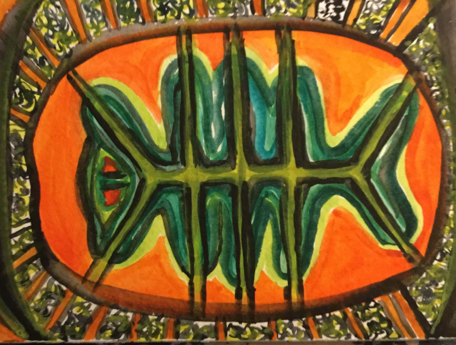
Painted Turtle

PAINTED TURTLE by Sea Dean 
I'm working on ideas for my summer display at Kelowna Airport. In sorting through the types of wild life we have in the area, I came across some fabulous images of the undersides of painted turtles. The Northern Painted Turtle is a famliar sight sunning themselves in our smaller lakes and pools, but I had no idea their underbellies were so beautiful. The patterns appear to be almost like a fingerprint with each variation belonging to a particular turtle.

Painted Turtle
5.5" x 4" cold pressed watercolor paper
Original Watercolor by Sea Dean


I am also working on fabric designs derived from this painting.


And the originals in all their glory.


Thursday, 2 March 2017

Crop and frame tweak - Cornucopia

CORNUCOPIA after cropping Framed
CORNUCOPIA after cropping (unframed)
This is a painting which I've always liked, but soon after I finished it the stretcher developed a nasty warp rendering it unsaleable. I removed the canvas from the stretcher intending to re-stretch, but I then discovered that the original stretchers were slightly smaller, metric and unobtainable at our local stores. For my SPLIT PERSONALITY solo show I decided to resolve the situation. I realized that cropping to 16" x 20" from the original 60 cm x 45 cm actually made a better composition. It also looked better in a dark frame rather than frameless. This is the before and after comparison. What do you think?

CORNUCOPIA before cropping

Wednesday, 25 January 2017

30 PAINTINGS IN 30 DAYS - TWENTY SIX - CLEMANTINE


CLEMENTINE
IPAD DRAWING
8" x 10" Limited Edition Print
$39 unmounted
$69 mounted on Birch Cradle
$150 Deep Wrap 9"x 9" Mirror Edge Giclee

You can choose whether to purchase the limited edition print ready to frame, the premium edition which is mounted on an 8" x 10" Birch Cradle or a gorgeous Canvas Giclee.

Clementine is a type of mandarin orange, but most of us associate the name with a song. We've all heard the chorus, but do you know the lyrics? Click here.

Oh ma darling, Oh ma Darling,
Oh ma Darling Clementine.
You are lost and gone forever,
Oh ma Darlin Clementine

This drawing serves as my 26th entry into the 30 in 30 challenge. Follow my blog so you don't miss any.

Posted as # 3

Sunday, 1 January 2017

30 PAINTINGS IN 30 DAYS - TWO - MUM


MUM IPAD DRAWING
8" x 10" Limited Edition Print
$39 unmounted
$69 mounted on Birch Cradle

Happy Birhday Mum

Over the years I've worked in many mediums and many genre. Currently I'm experimenting to discover which genre suits my iPad drawing technique best. This Floral would make a lovely bright addition to a dark corner. You can choose whether to purchase the limited edition print ready to frame or the premium edition which is mounted on an 8" x 10" Birch Cradle.

This drawing serves as my second entry into the 30 in 30 challenge. Follow my blog so you don't miss any.

Posted as # 11

Saturday, 29 October 2016

IPAD DRAWINGS - Ocean Series - Ocean Bed

OCEAN BED
Oceans Series by Sea Dean
Copyrighted iPad drawing
Available as a one time use download or limited edition print

Divers know that the ocean bed can be a colorful place, particularly in a coral reef. The almost fluorescent colors really come to life at night, when many sea creatures create their own light.


Friday, 23 September 2016

SUMMER SUN - Day 24


SUMMER SUN
by Sea Dean
Digital Painting

This simple painting has a lot of impact. It comes printed on quality paper and mounted in a finely cut mat. The painting is #24 of 30 paintings for the Leslie Saeta Challenge.

Wednesday, 7 September 2016

BLACK MOUNTAIN GLOW - DAY 8


BLACK MOUNTAIN GLOW
by Sea Dean
8" x 10" Birch Cradle
Acrylic
On Exhibit at Skyway Kelowna Airport

I see the tip of this mountain from my windows, but walk half a block to the amazing local park and I see it in all it's glory. I particularly like taking that walk around sunset. The top of the mountain is covered in trees, but the lower portion was grazed out a hundred years ago by cattlemen provisioning the gold rush. These grasslands are yellow ocher, but at sunset they glow with orange, pink and red.

This mountain is locally called Black Mountain, but on the maps you will see it called Black Knight Mountain. This is thought to be the fanciful creation of a map maker whose name is lost in history, perhaps trying to make the mountain sound more romantic. We also have a Sleeping Beauty moniker for a local range, so perhaps he had been reading too many romantic tales.

When you drive into the Okanagan Valley from Vancouver this mountain dominates the view as you cross Okanagan Lake via the Bennet Bridge. It is a well known landmark.

Post 118 Leslie Saeta challenge

Friday, 1 July 2016

SUNDOWN


SUNDOWN
by Sea Dean
10" x 12" Deep Wrap Canvas
Available at Artfinder

I love the sunsets of summer and this is no exception. There are layers of purple, violet, red, maroon, hot pink and yellow with tiny glints of reflected light in the water. It was inspired by a photo I took at 30,000 feet over Georgia Strait in British Columbia.

Thursday, 23 June 2016

SUN I

SUN I
12" x 9" Canvas Mounted on BIrch Cradle
Ready to Hang
Available in my Artfinder Shop

This is a mixed media piece in the Affordable Series. It includes a generous helping of Ink, texture and acrylic. Many more to come in this series.

Orginally they were called "Affordables because they came as rolled canvas sheets, but the early ones have now been mounted on deep birch cradles and the edges have been painted to match the subject. These pieces are all experimental in nature and demonstrate my passion for free flowing, intuitional abstract.

Sunday, 19 June 2016

CREST OF THE WAVE


CREST OF THE WAVE
by Sea Dean
7" x 5" Canvas Panel
Available on Artfinder


This painting has lashings of texture and energy. Now available in my Artfinder Shop.

Sunday, 29 May 2016

OKANAGAN SUNSET by Sea Dean - LAKE COUNTRY ART GALLERY GETS AWARD

OKANAGAN SUNSET
8" x 10" Cradle Board
Reserved for Skyway Kelowna Airport

This painting has been submitted to Skyway and I'm sure they'll love it and it will sell very quickly. However, I do have other paintings in the series available. I can also paint one especially for you in a size that suits your space.


Congratulations Petrina McNeill, the board and committee members, the volunteers and our visitors. Every one of you makes a difference at LCAG and in making the world a more beautiful place.

Sunday, 17 April 2016

LAKE COUNTRY COFFEE HOUSE SOLO EXHIBITION - JASPERWARE

After the excitement of the blog hop it's hard to come back to earth. However, my first solo exhibition of the year is also underway, so I will share some paintings in the show. This wall shows three of my experimental works that feature a raised leafy pattern.

COOL JASPERWARE by Sea Dean

TAPESTRY by Sea Dean
WARM JASPERWARE by Sea Dean
In these images you can see the delicate raised work that looks like fine porcelain, hence the name Jasperware from it's similarity to Wedgewood. I'm happy to create bespoke paintings in this series in any size and to suit your color scheme.


Each painting is 8" x 8" on 3/4" wrap canvas and costs $80 plus shipping
To purchase any or all of these three paintings please contact me and I'll check availability.

To view and purchase my prints, postcards and Art cards click here
To view or purchase my paintings click here or here

Tuesday, 29 March 2016

LAST LIGHT


LAST LIGHT
8" x 10" Cradle Board


This is an inspirational painting that started with a desire to show the graded blues of a lake. I was going to put flowers in the foreground, but they tend to close up at this time of day, so I chose a marshy rivulet. I wish you could see the true glory of that glow on the blades of grass.

I think this one is destined for my airport location because their lighting will suit the glowing nature of the painting. My upcoming solo is in quite a dimly lit area with barn wood walls so I don't think this will show to it's best advantage there.

Thursday, 25 February 2016

STUDY IN UMBER AND ORANGE


STUDY IN UMBER AND ORANGE
5" x 7" Canvas Panel


My final wintry scene before my thoughts turn to the joys of spring. This is an abstract in thick impasto and you can enjoy it as a non-representational piece of art or make of it what you will. The sweeping strokes could be a ski slope, a wintry road or ocean foam.

I love this piece and as you can see in the image, it fits with any decor. The piece can be framed or for a more contemporary look, hang as a panel with an adhesive hanger.


Tuesday, 16 February 2016

FROM MOUNTAIN TO OCEAN IN SIX STEPS

This is a commission to change an unwanted large oil painting with a nice frame, to an ocean painting with lots of waves that would be more to the patron's taste. First I showed her some of my previous works. This is where a smart phone or tablet comes in handy.


Next I painted a preliminary 8" x 10" panel. The client wanted to hang the painting in her bedroom as soon as it was complete so I wanted to test some quick dry I was unfamiliar with. I was also new to the brand of paint available in the vicinity and wanted to see how it worked when mixed with the Japan Dryer.


I liked the impasto effect in this sample painting but I prefer more color peeking through from under-painting. As the painting I was over-painting was mainly orange, I thought I would try and retain some of it. The quick dry product worked well, but was quite smelly. So back to the store I went and found some Daler Rowney Alkalyd Gel which had great texture, was less smelly and dried the thick impasto very quickly.


Image I - The original painting, a drip painting with a black hump and too much orange for the client's taste.

Image 2 - Shows my start. A friend gave me the tip to put some gel on top of the old painting to help the new oil paint adhere and this seemed to work really well. Here I was erasing the distracting hump. I also added a few wispy clouds to see the effect.

Image 3 - To hide the drips, I painted Titanium White over them and softened the edges so I didn't have a problem with ridges later. White is a good opaque choice for coverage when you don't have access to under-painting white or gesso. I also added a few more clouds.

Image 4 - I've added foreground waves leaving some glints of orange. I told the client I could paint over these later if she didn't like them. (She was sitting on the sofa watching the process).

Image 5 - Most of the black has been painted over and some cool blue added  to suggest distant breakers or ocean current. I have also softened the horizon with some paler blue.

Image 6 - The client said she liked the orange glints so I added some in my own brushstrokes. I have also added in some brushy sky to blend the style across the painting. I've blended edges, added some impasto and softened the orange sandy bits.

More detail and the finished painting tomorrow.